Overview
This project was a redesign of the Cheyenne Mountain Zoo ticketing experience. The current ticketing experience is outdated, repetitive, and confusing. As part of a class assignment, I took on, and succeeded in, the challenge of redesigning the ticketing experience to improve user satisfaction and overall experience. The redesign resulted in a more efficient ticket flow that reduces user confusion.
The Challenge
The core challenge was information management. The original site buried visitors under policies, special event details, general zoo info, and opening hours, all competing for attention on the same pages. The ticket purchase flow itself was spread across too many steps, with inconsistent pricing information and no clear hierarchy.
The goal: make the ticketing experience as efficient as possible without losing information visitors actually need, and do it in a way that feels like the zoo itself: warm, welcoming, and worth the trip.
Research & Discovery
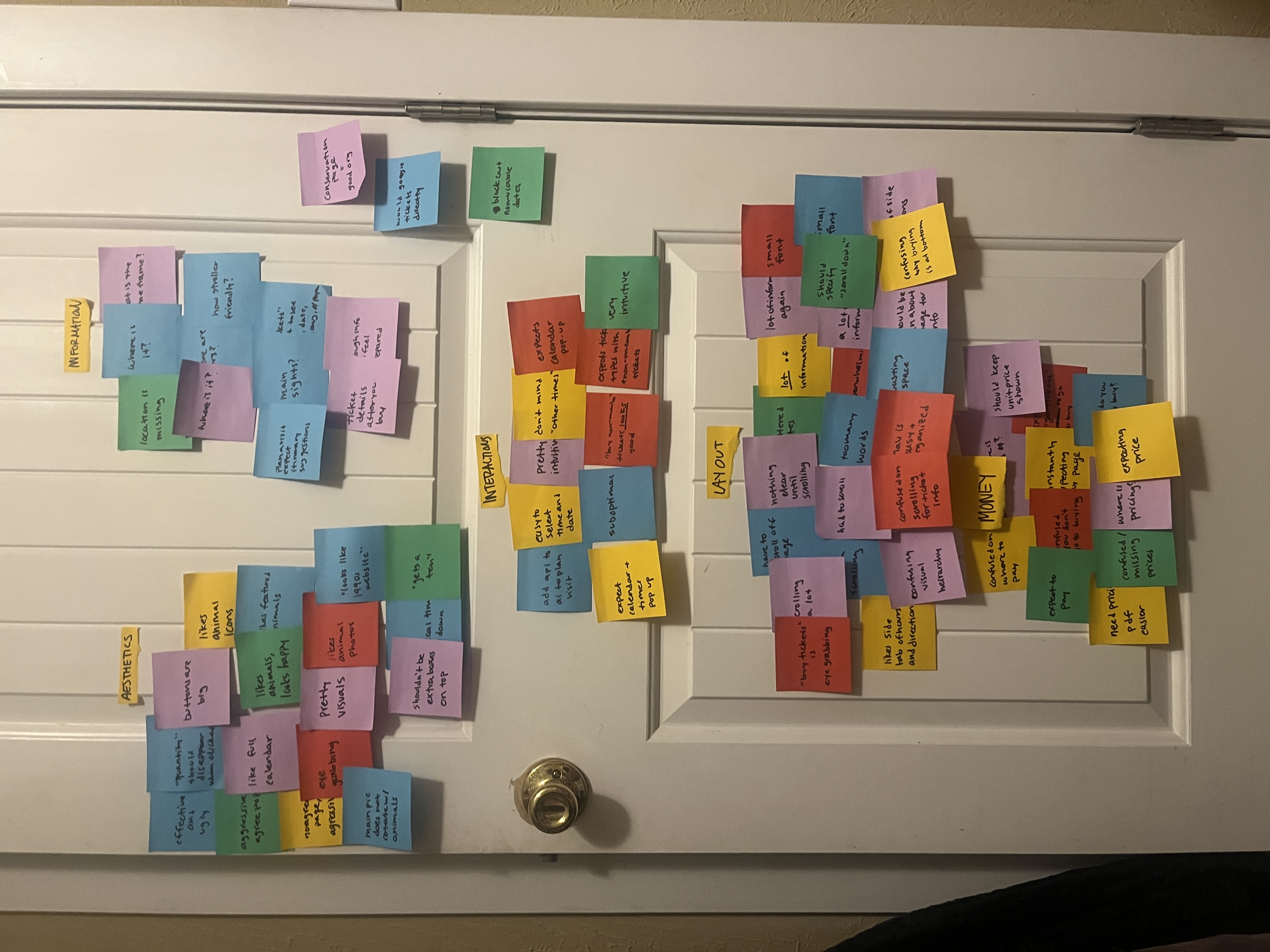
I began with usability testing of the existing experience, conducting user interviews and building an affinity map to surface recurring pain points. Key issues that emerged: information overload, confusing visual hierarchy, inconsistent pricing display, and too much scrolling before reaching the actual purchase flow.
The affinity mapping process surfaced opportunities to prioritize the right information at the right moment, design a direct and linear ticket flow, and make pricing transparent from the first screen.
Participants were candid:
- "looks like a late 1990s website"
- "I could have programmed this website — me, not a programmer — better"
- "words are death of a website"
- "barely effective and extremely suboptimal"
Problem Statement
Zoo visitors buying online tickets need an efficient process to buy tickets because the current process is long and discourages people from completing their purchase.
Task Flow
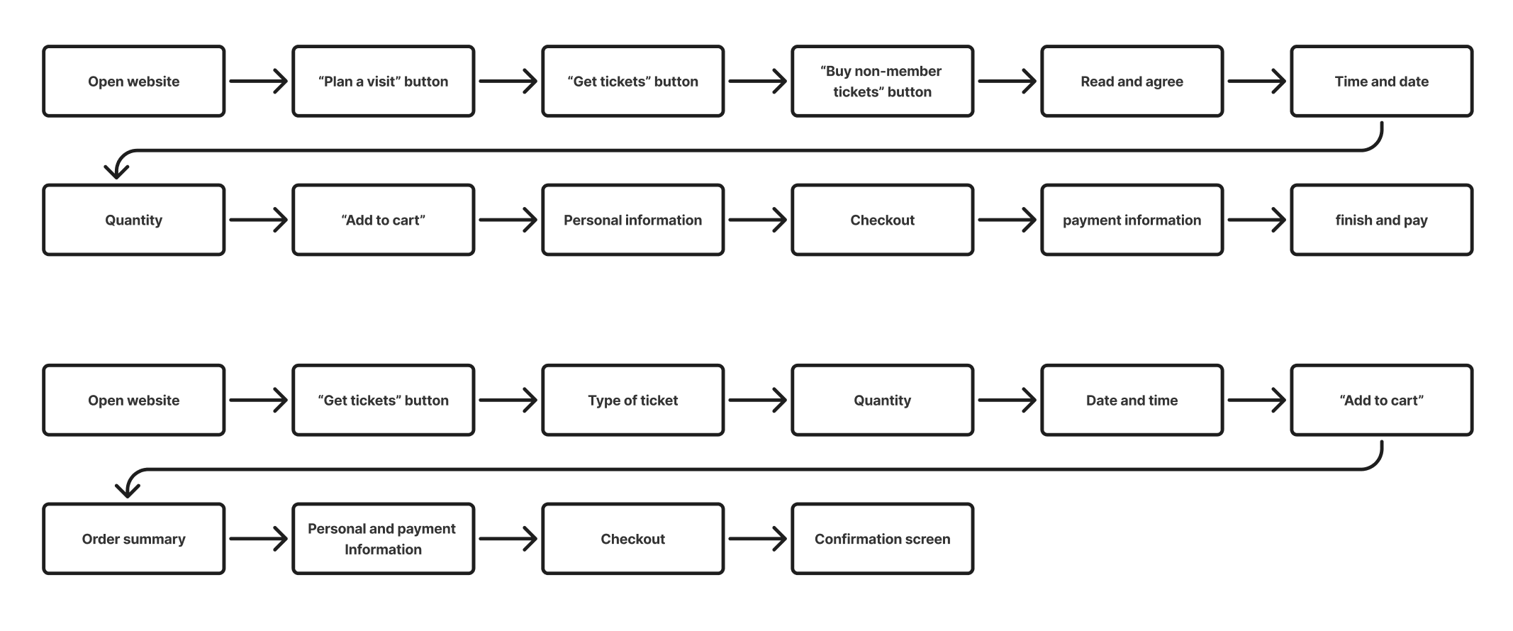
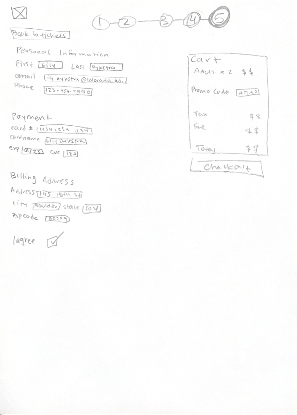
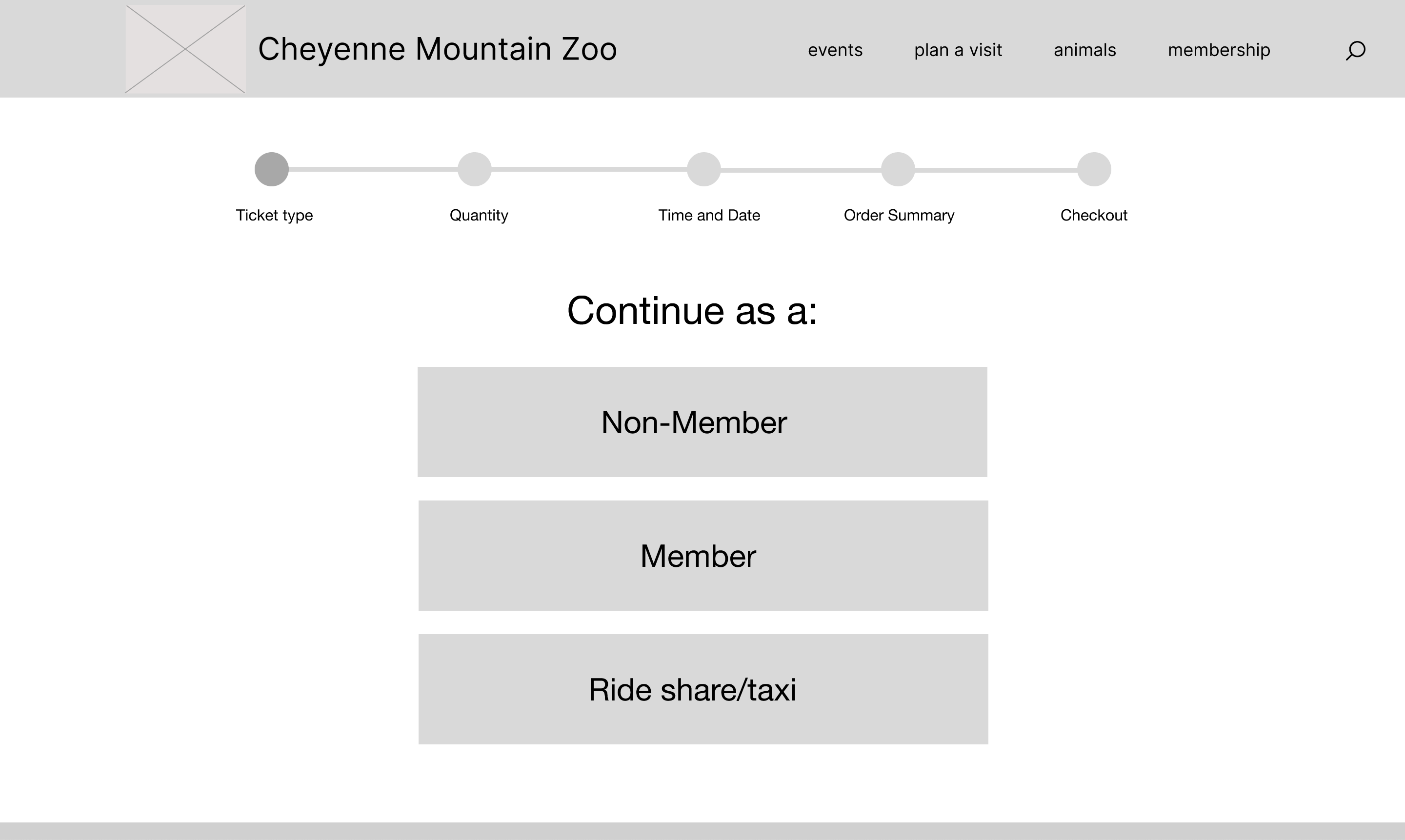
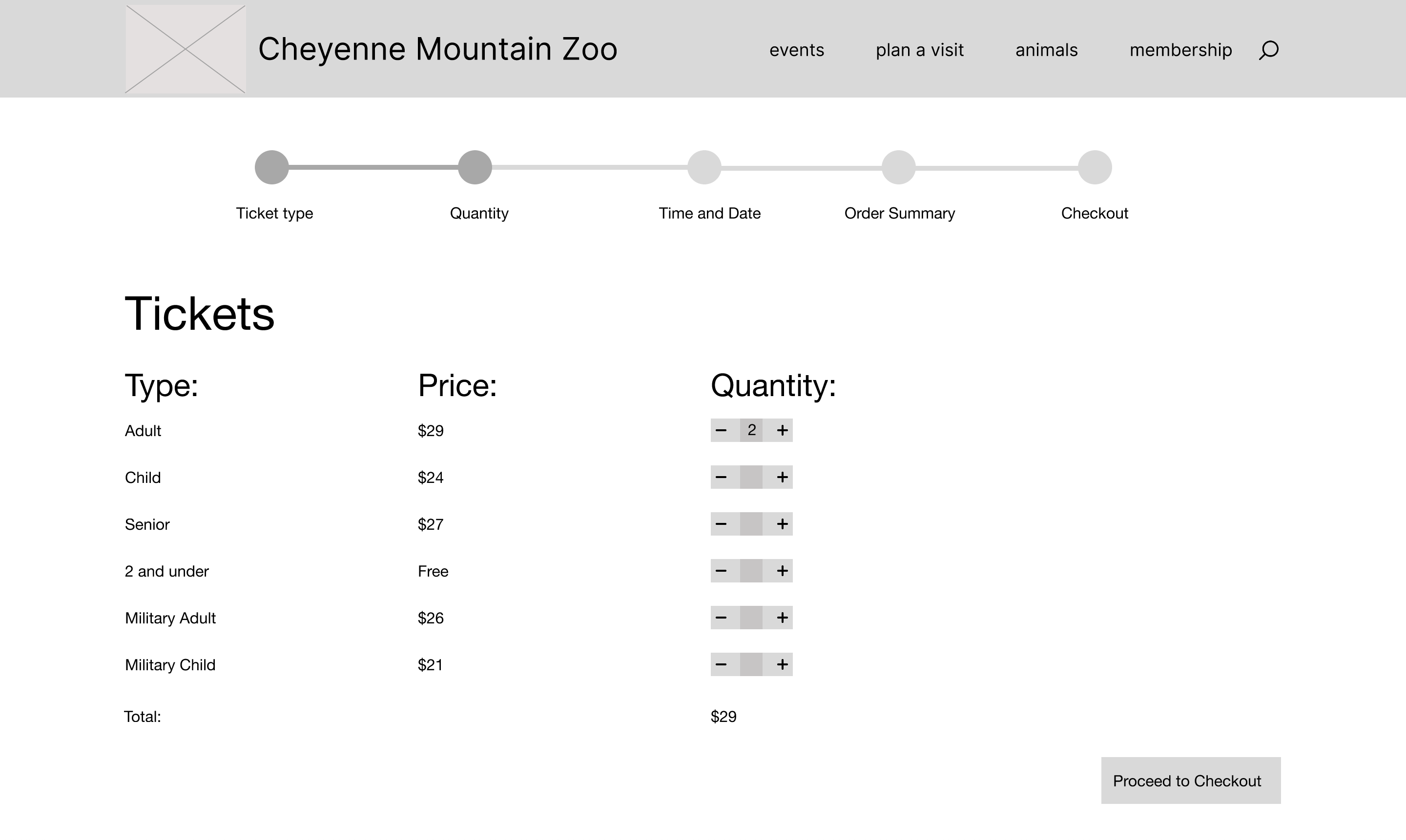
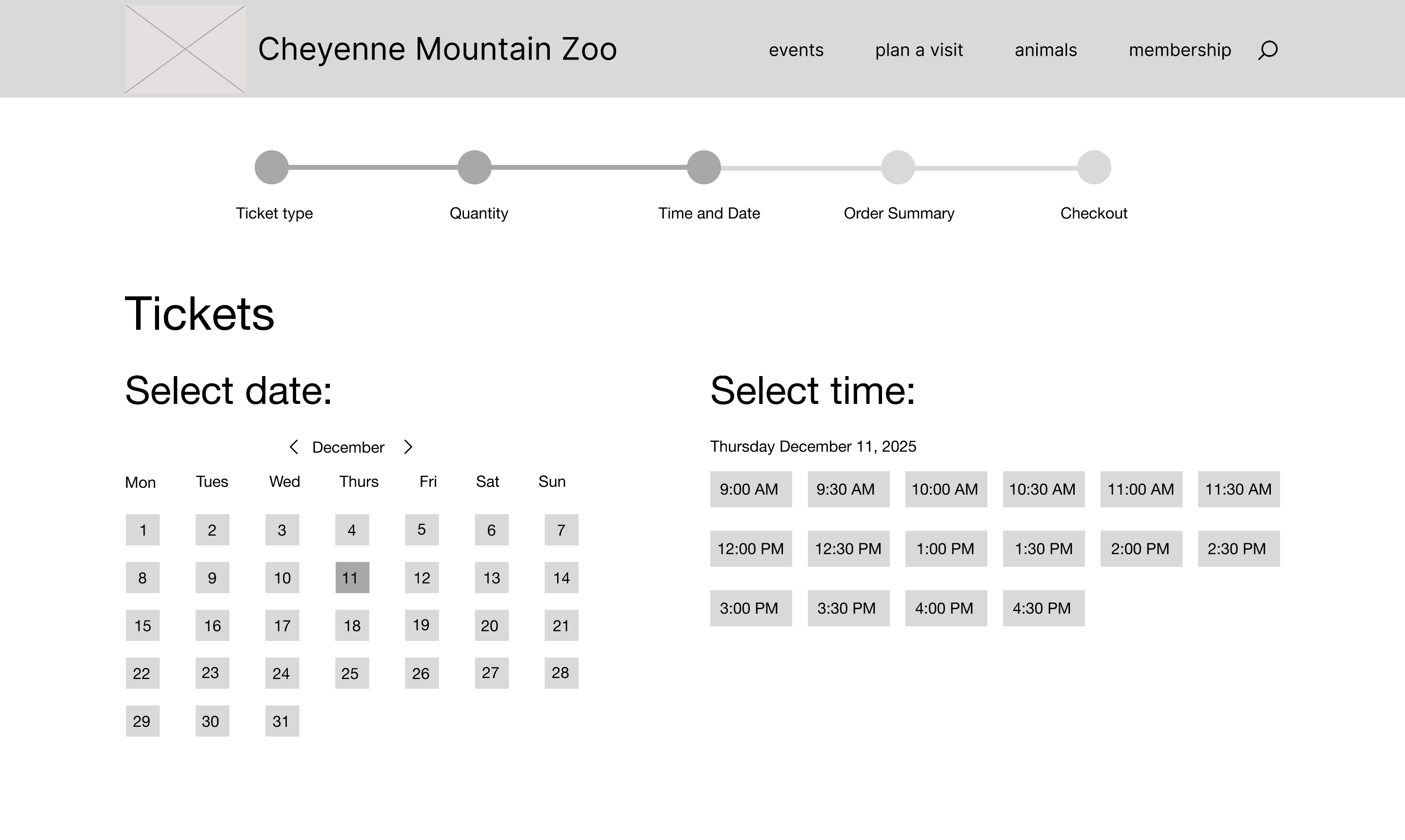
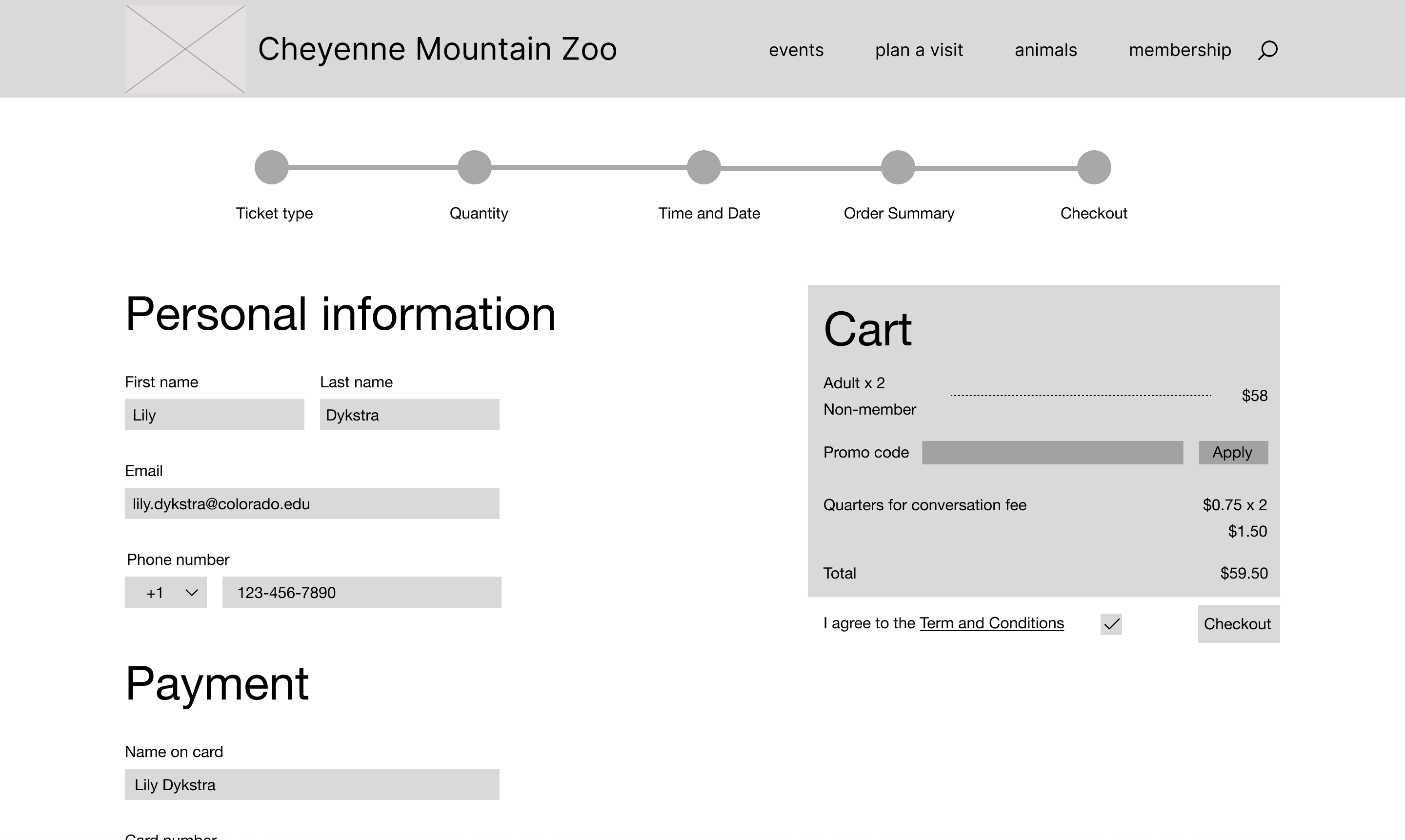
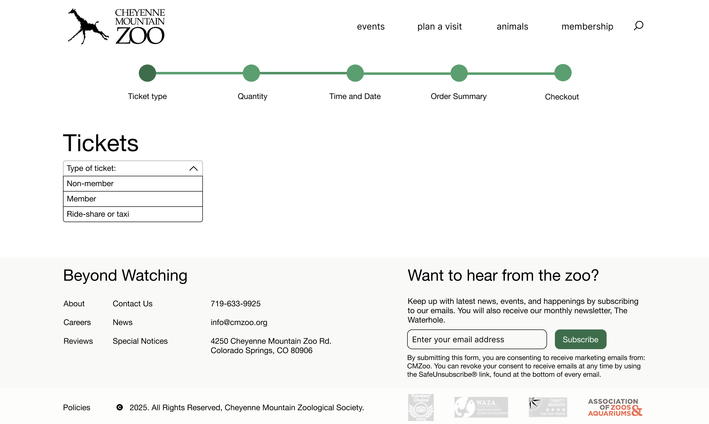
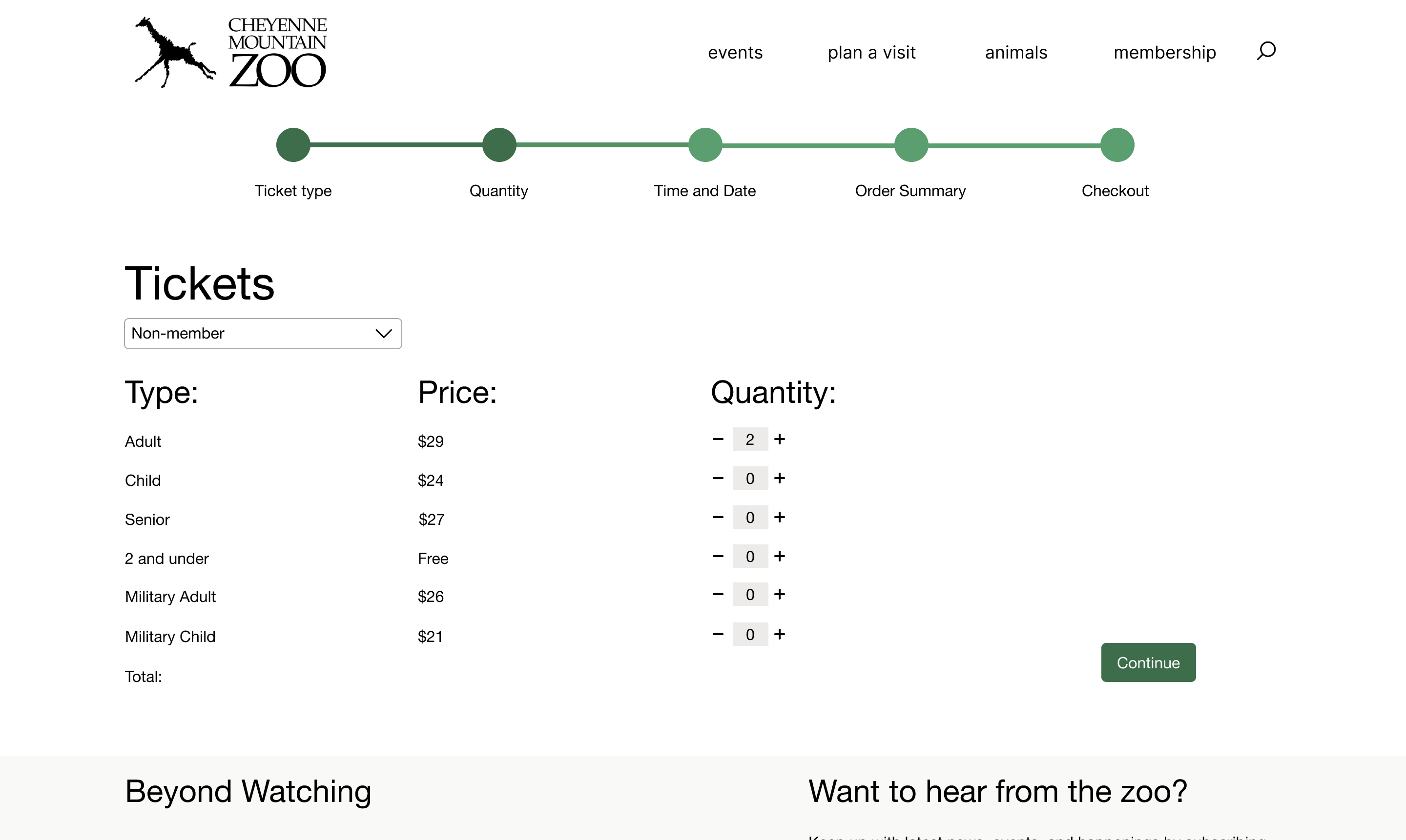
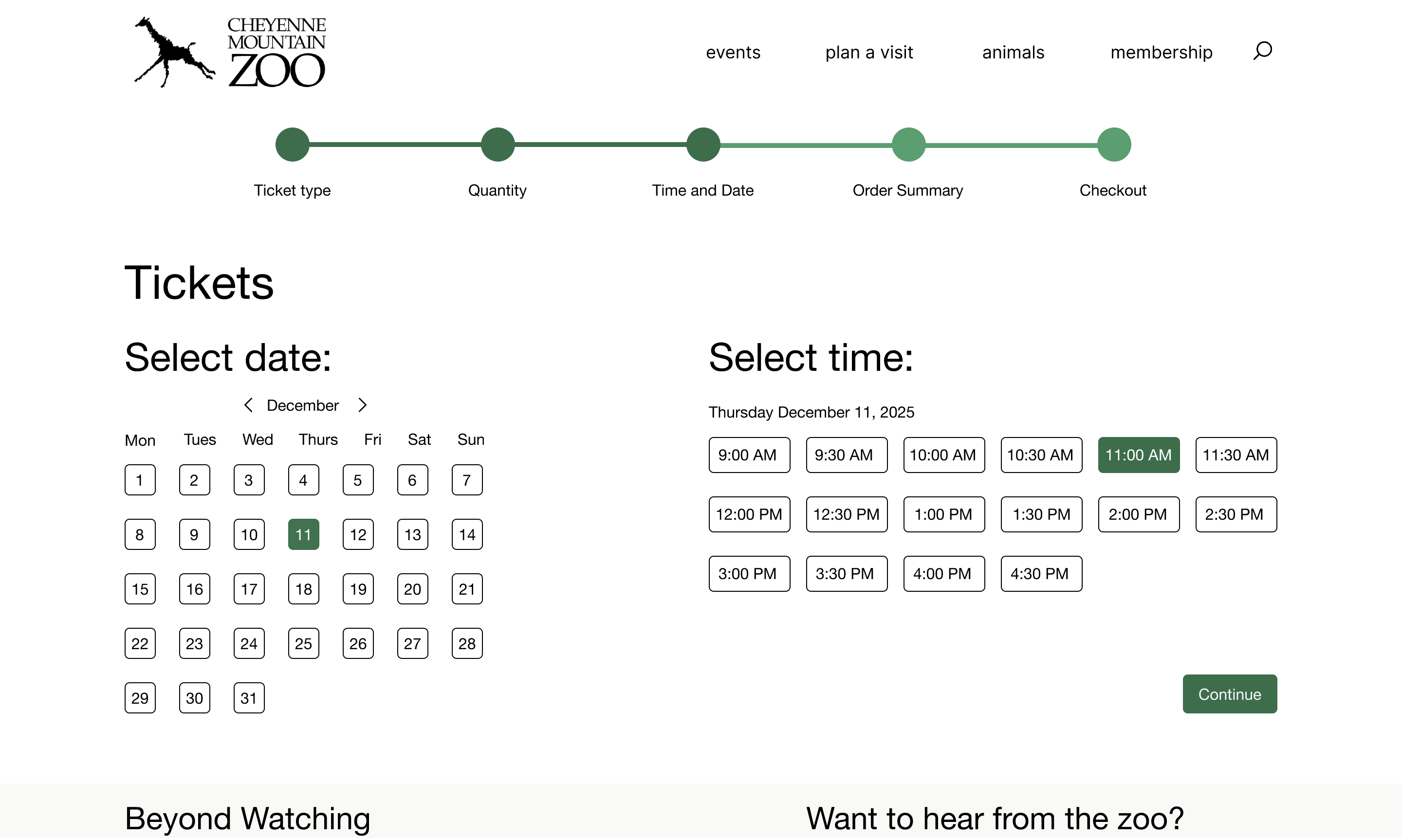
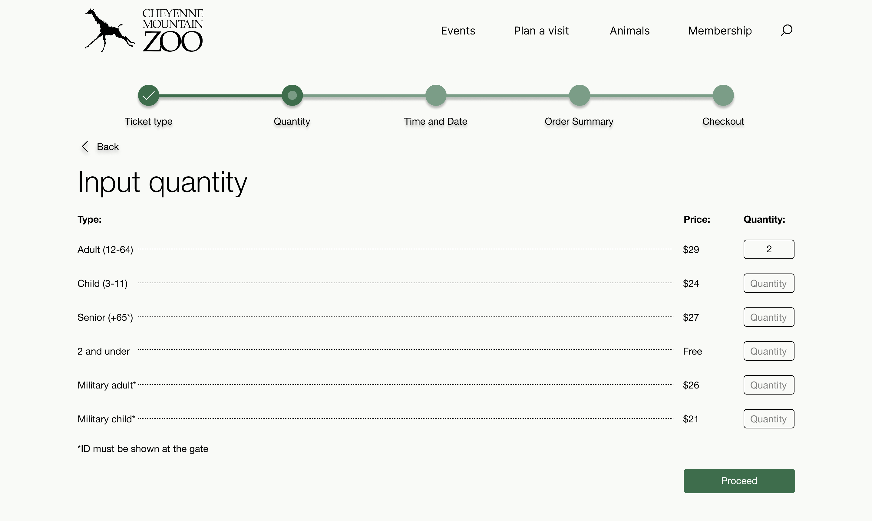
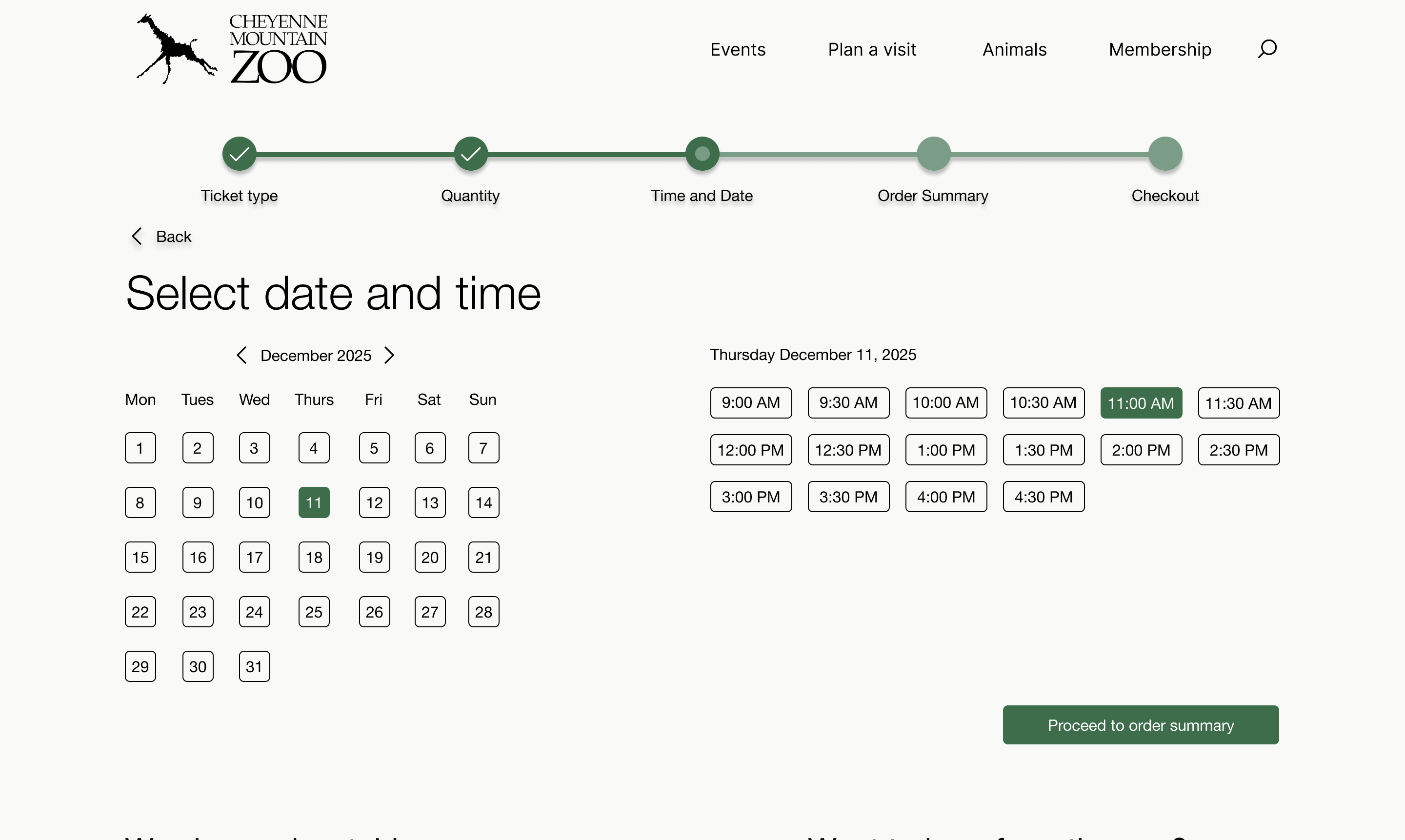
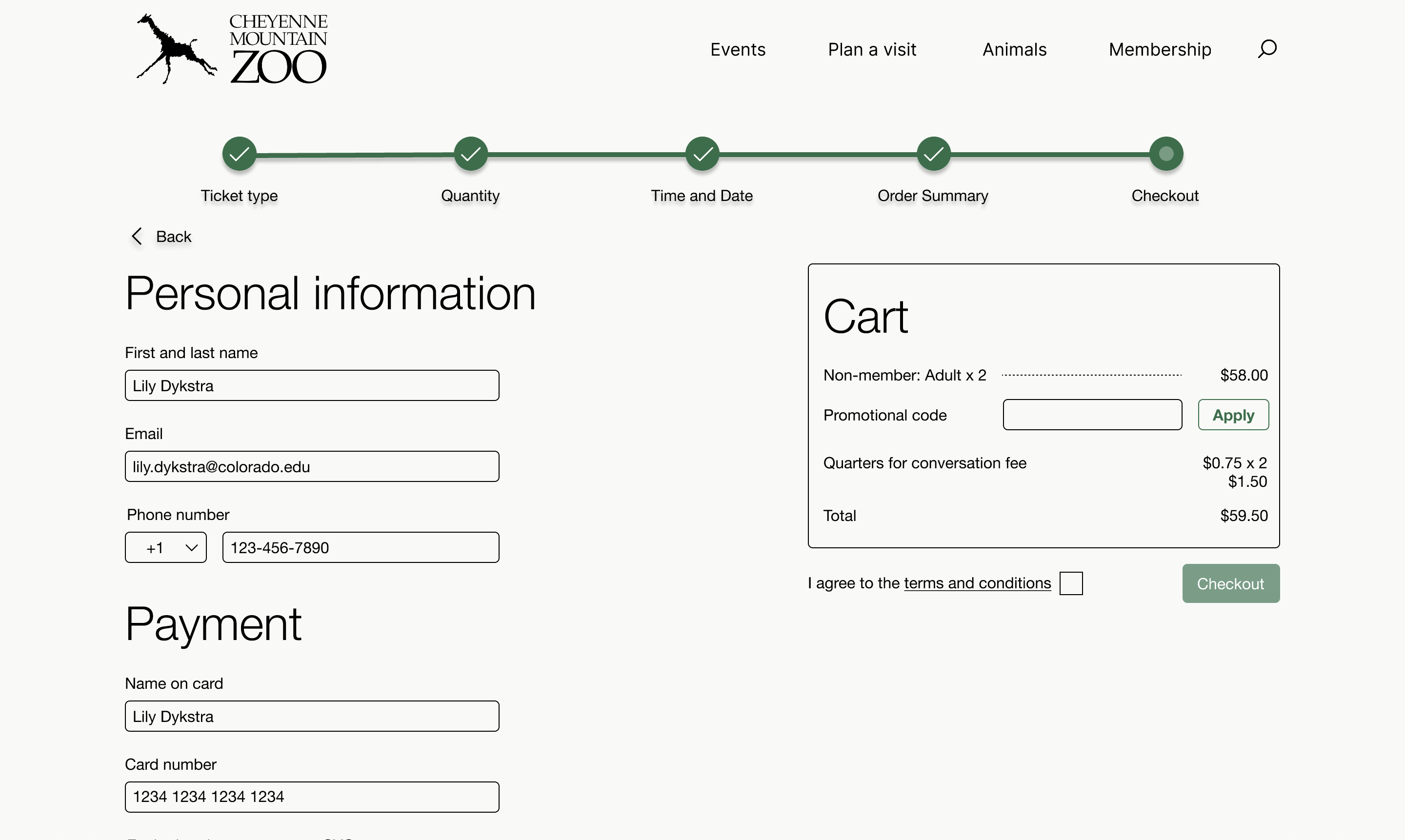
Using insights from user interviews and affinity mapping, I mapped out what information truly needed to be in the flow versus what could be surfaced elsewhere. The proposed redesigned task flow cut unnecessary pages, moved quantity selection earlier, and eliminated repeated data entry.
Wireframing: Low to High Fidelity
I worked through three fidelity levels, using feedback at each stage to make increasingly informed decisions about layout, content hierarchy, and interaction design.
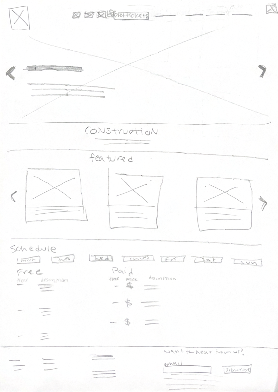
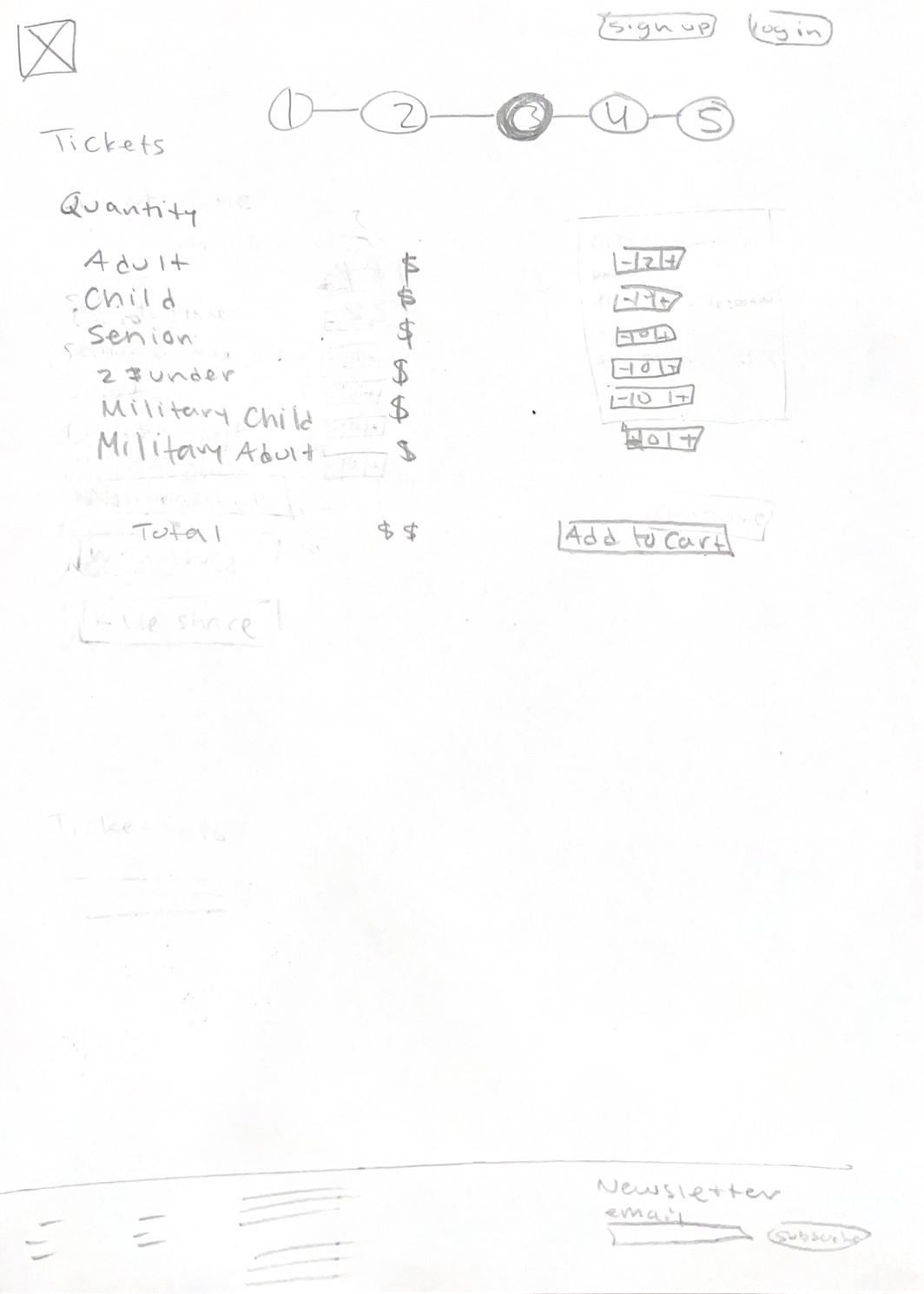
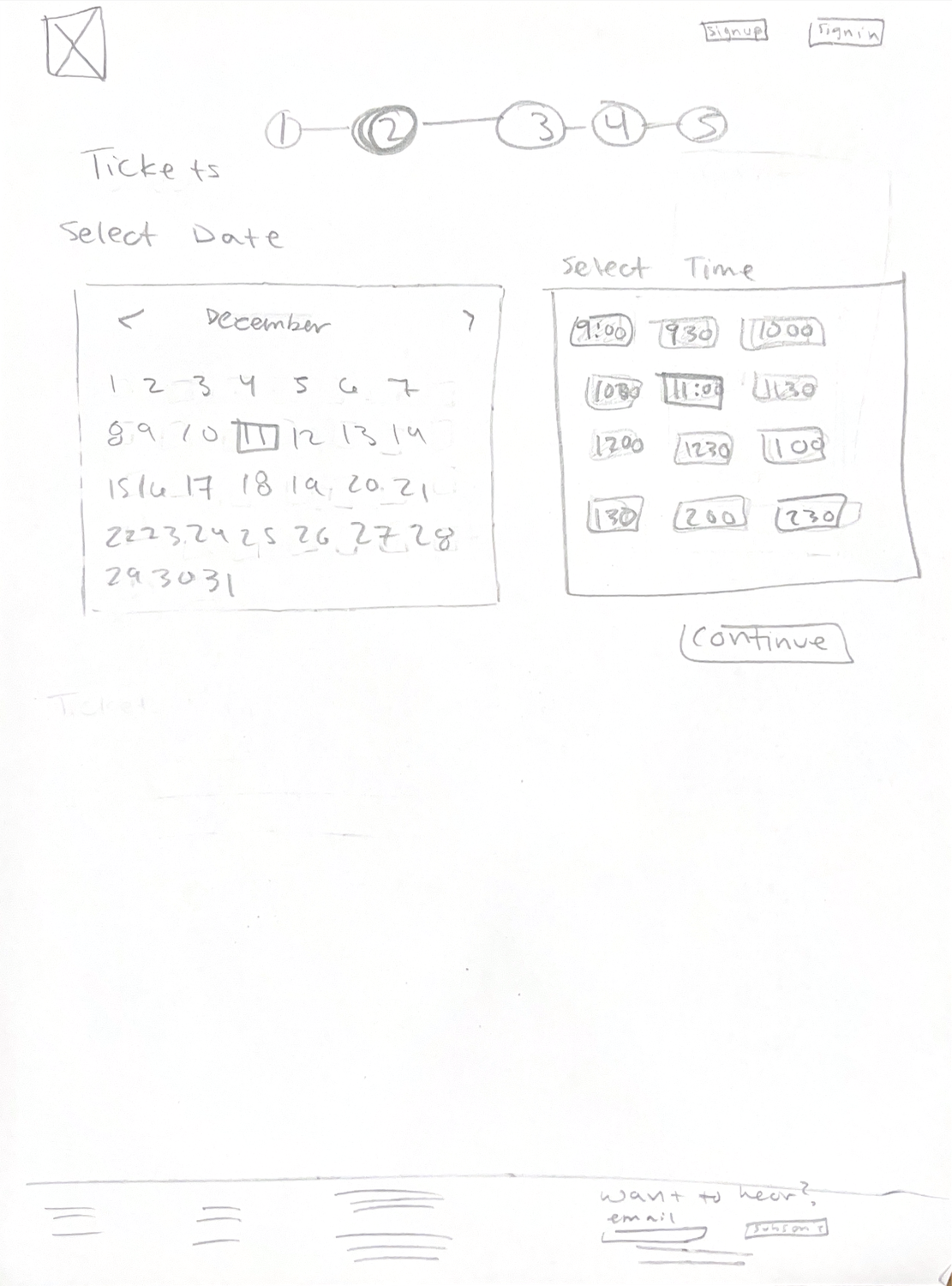
Low Fidelity
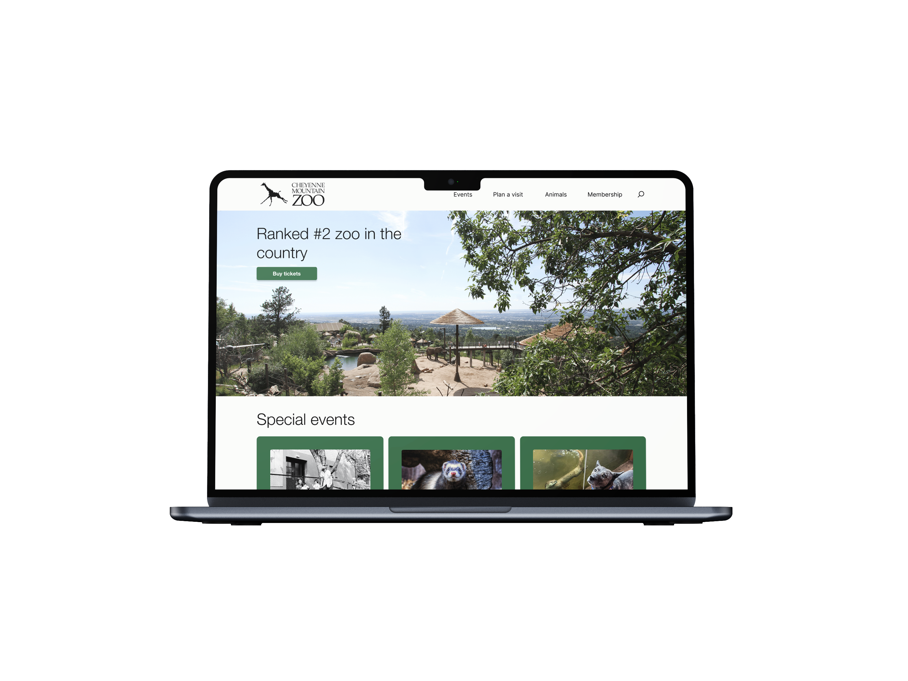
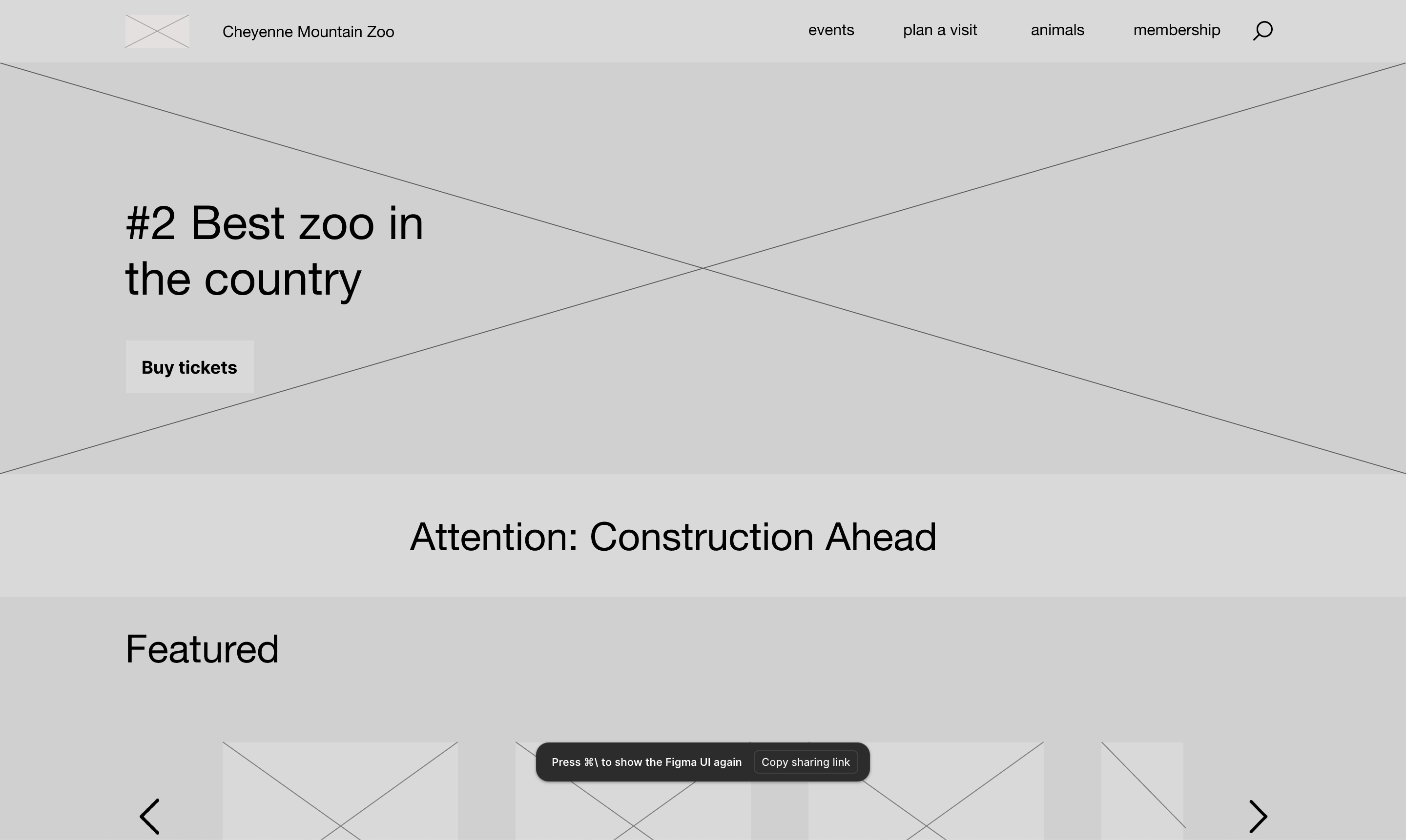
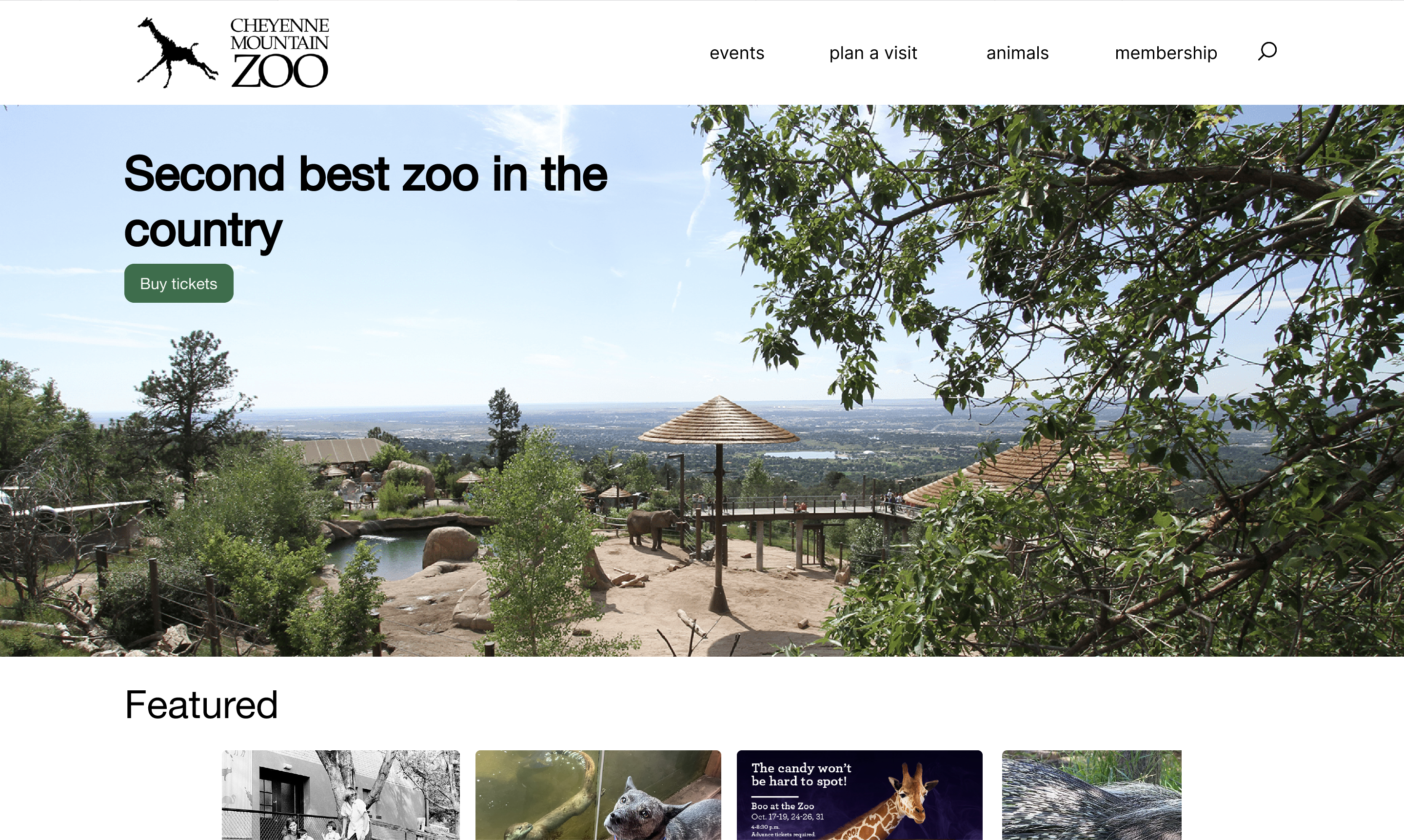
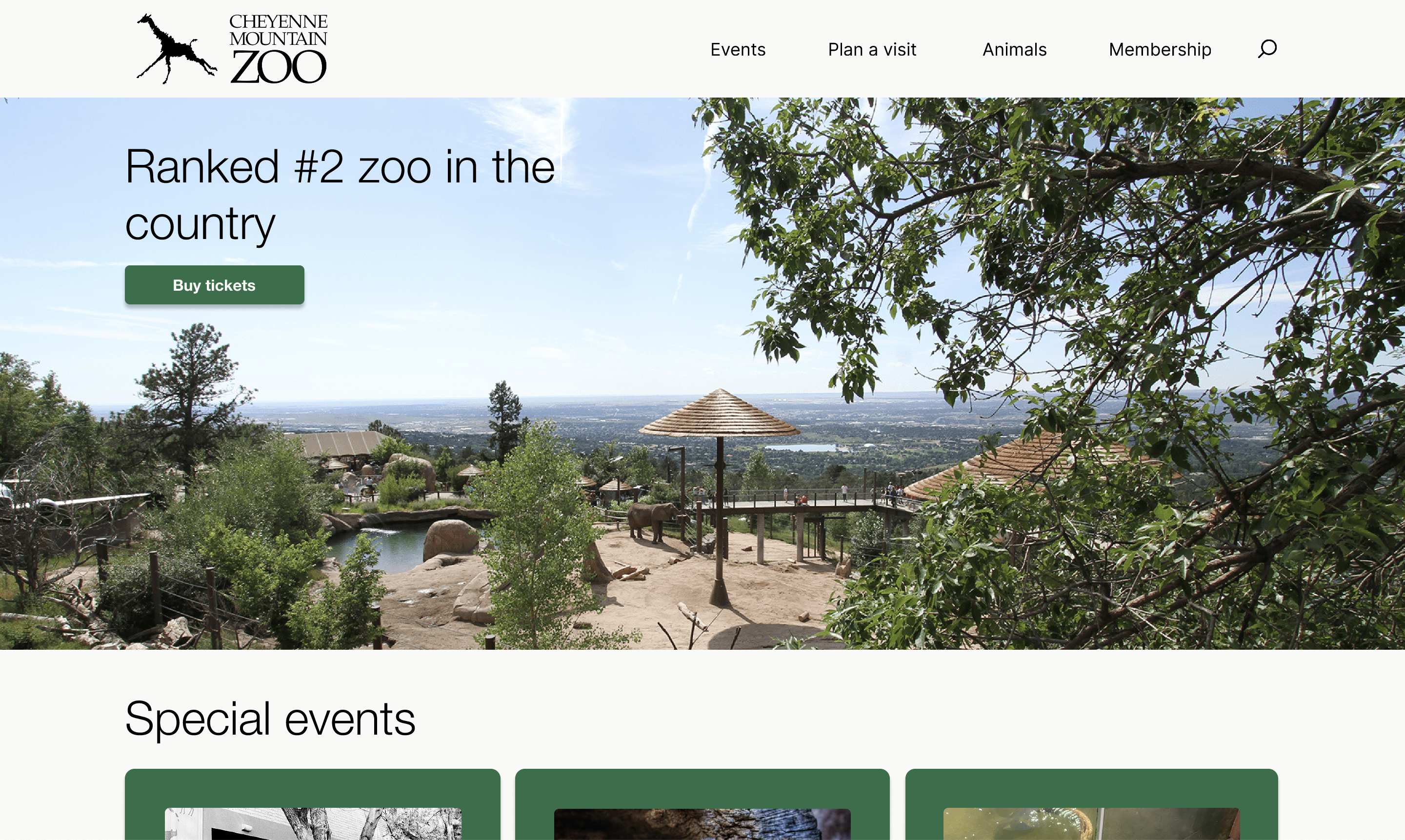
For low fidelity, I sketched out my proposed task flow. My main changes were cutting down on unnecessary front page information. I redesigned the home page, prioritizing zoo promotion and their schedule. I also reduced the amount of pages it takes to get to buying tickets.
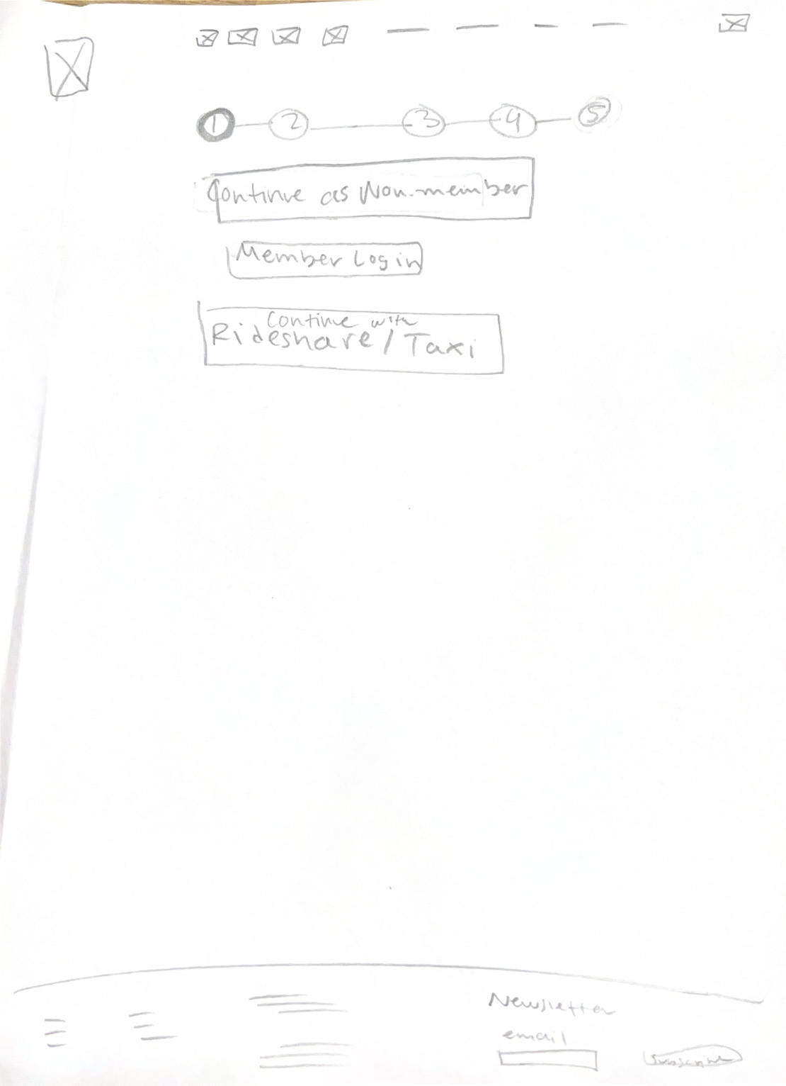
Mid Fidelity
For mid-fidelity I took my low-fidelity and directly translated my sketches into a digital version with a couple changes. The most distinct changes I implemented were adding the header and footer to every page. This allowed me to visualize the final product more clearly and informed my interactive prototype decisions.
High Fidelity — V1
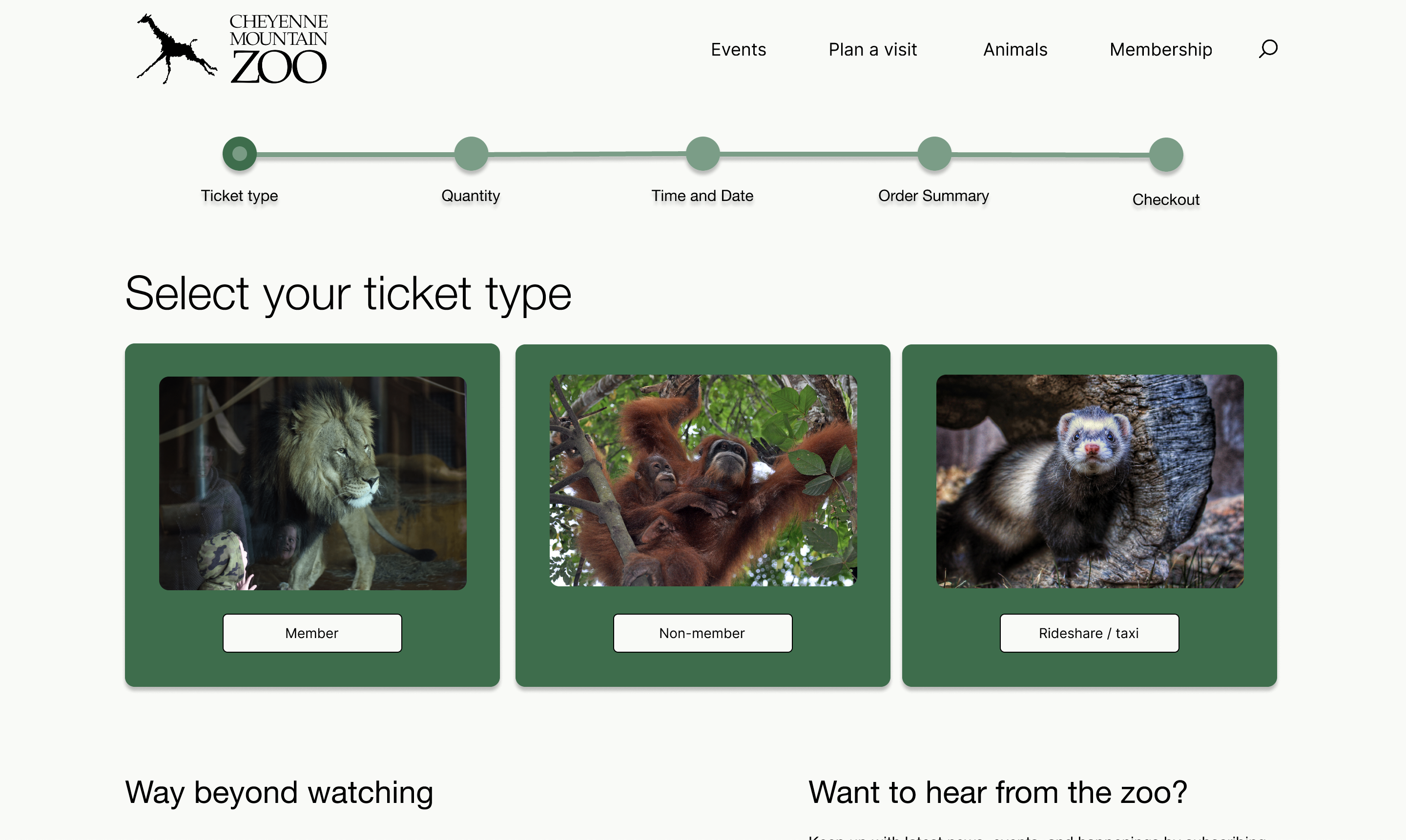
For the high fidelity version 1, I added images and color to solidify the overall design. Additionally, interactivity was added via button clicks, hover states, and scrollability. I implemented feedback as the process continued, such as modifying the ticket type selection page.
High Fidelity — V2
For my last iteration, I implemented the most design changes to date after intensive feedback. I changed my home, ticket type, and quantity screens entirely, fixed my primary and secondary buttons, and finalized all of my spacing. I also fixed color contrast errors in order to make the website as accessible as possible.
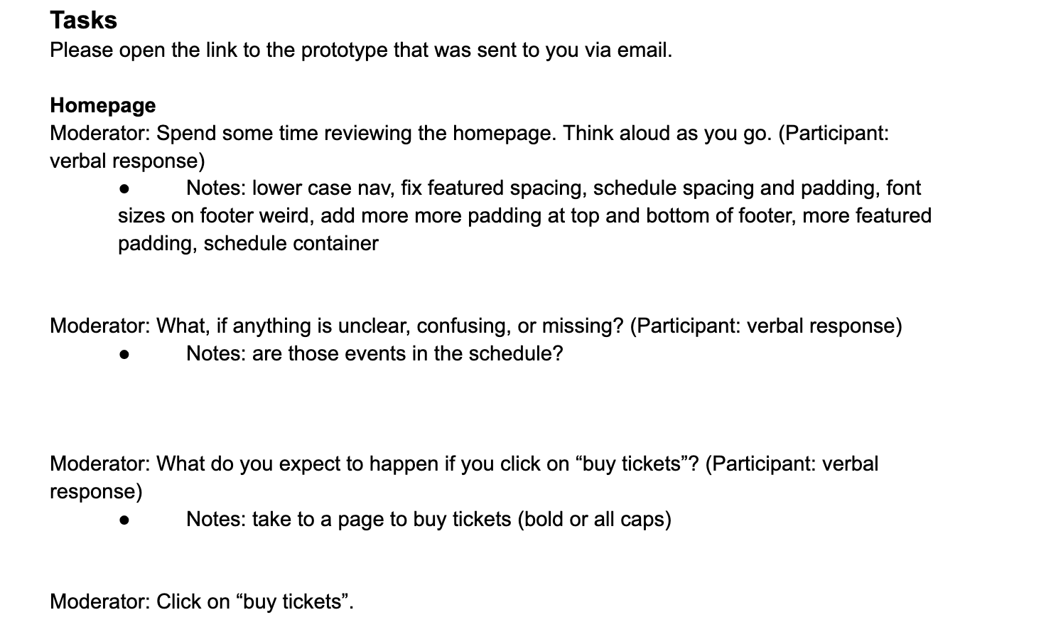
User Testing & Iteration
I tested the high-fidelity prototype with 3 participants and asked them to walk through the full ticket purchase flow. Key pain points discovered: the schedule layout on the homepage, the ticket type selection screen, the animals page layout, status bar color contrast, and missing information on the order confirmation page.
In response, I made the following updates:
- Replaced the struggling schedule layout with content that was clearer to organize
- Added padding throughout the animals page for better readability
- Found a higher-contrast shade for the status bar, resolving an accessibility issue
- Reverted the ticket type screen to the mid-fidelity button-based design, which tested better
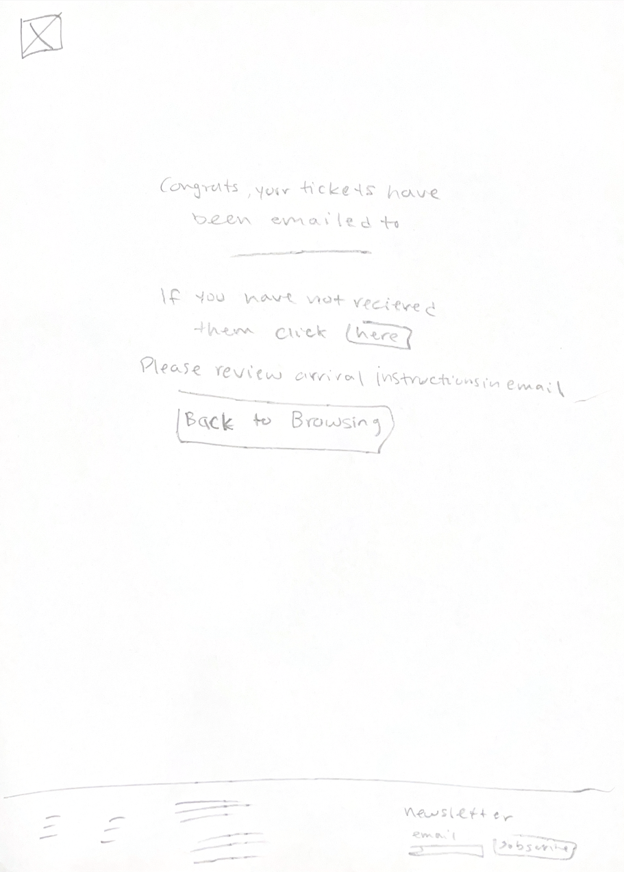
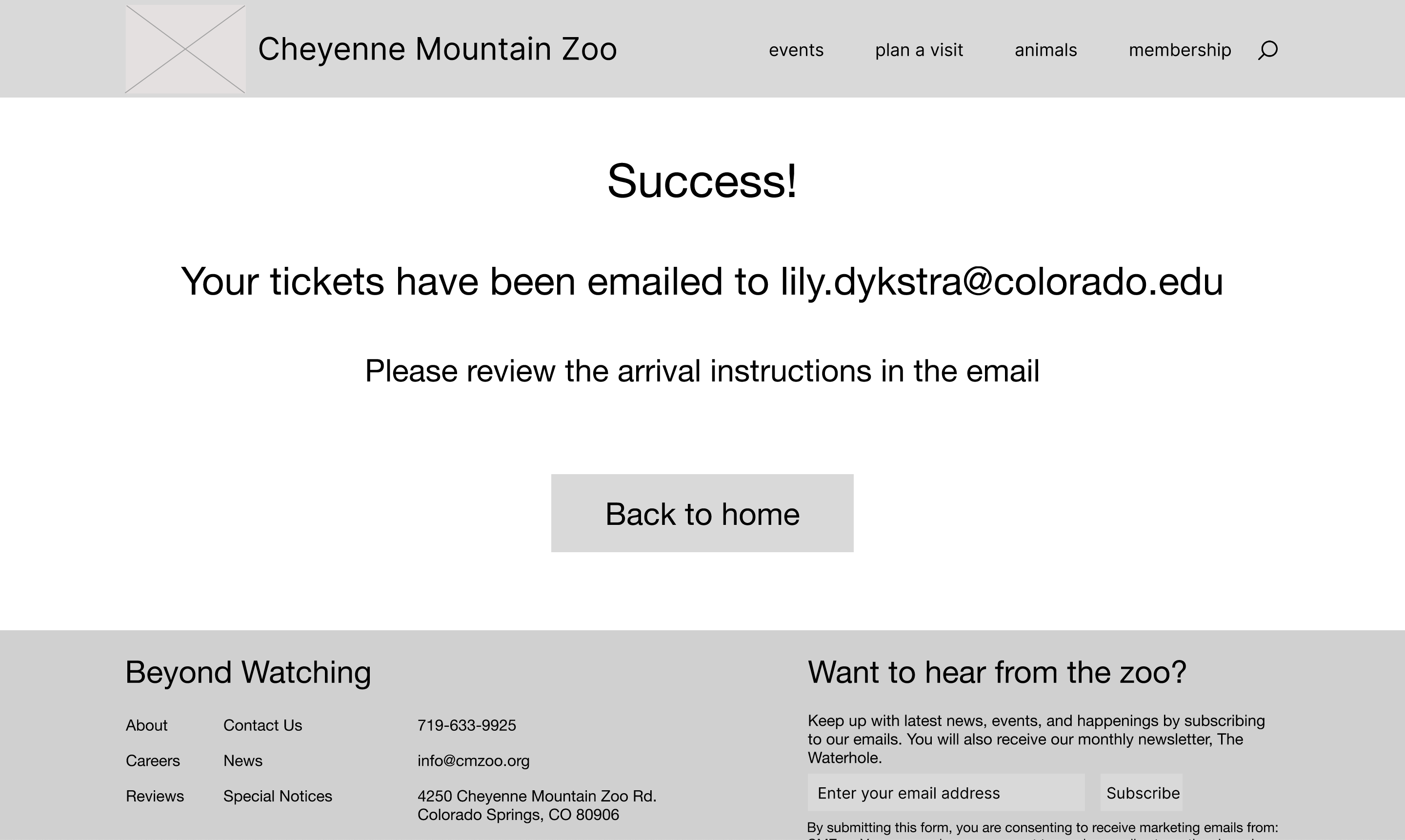
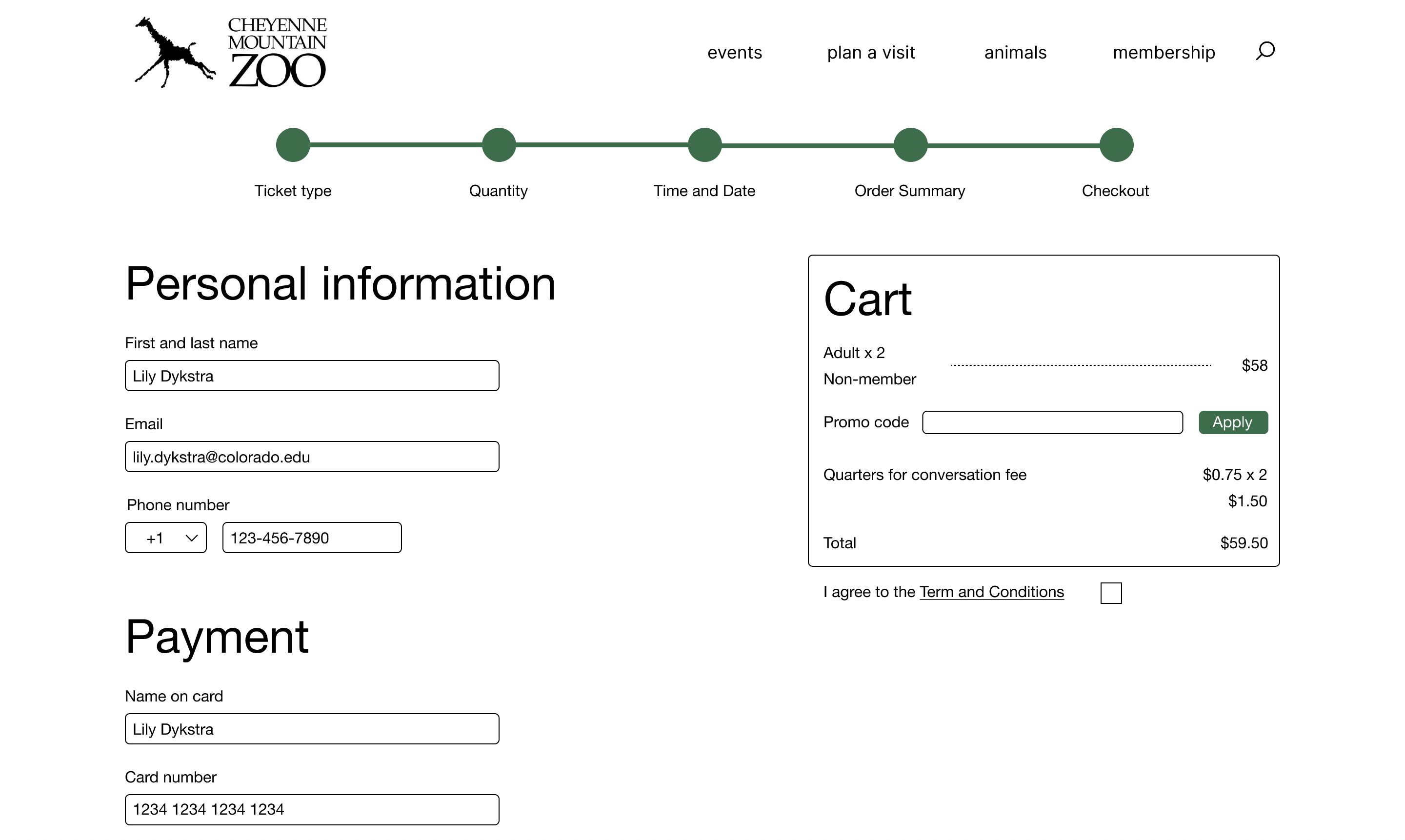
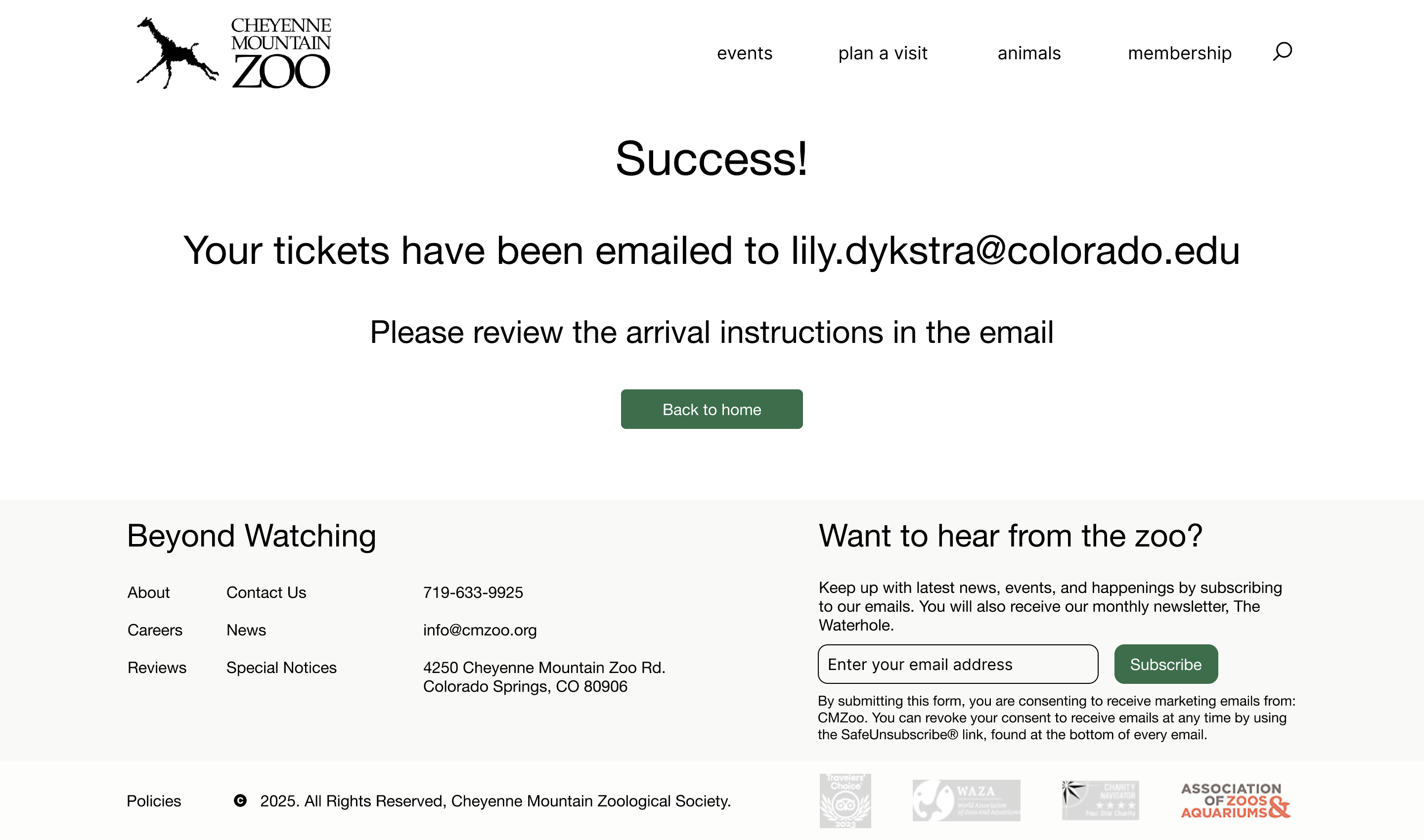
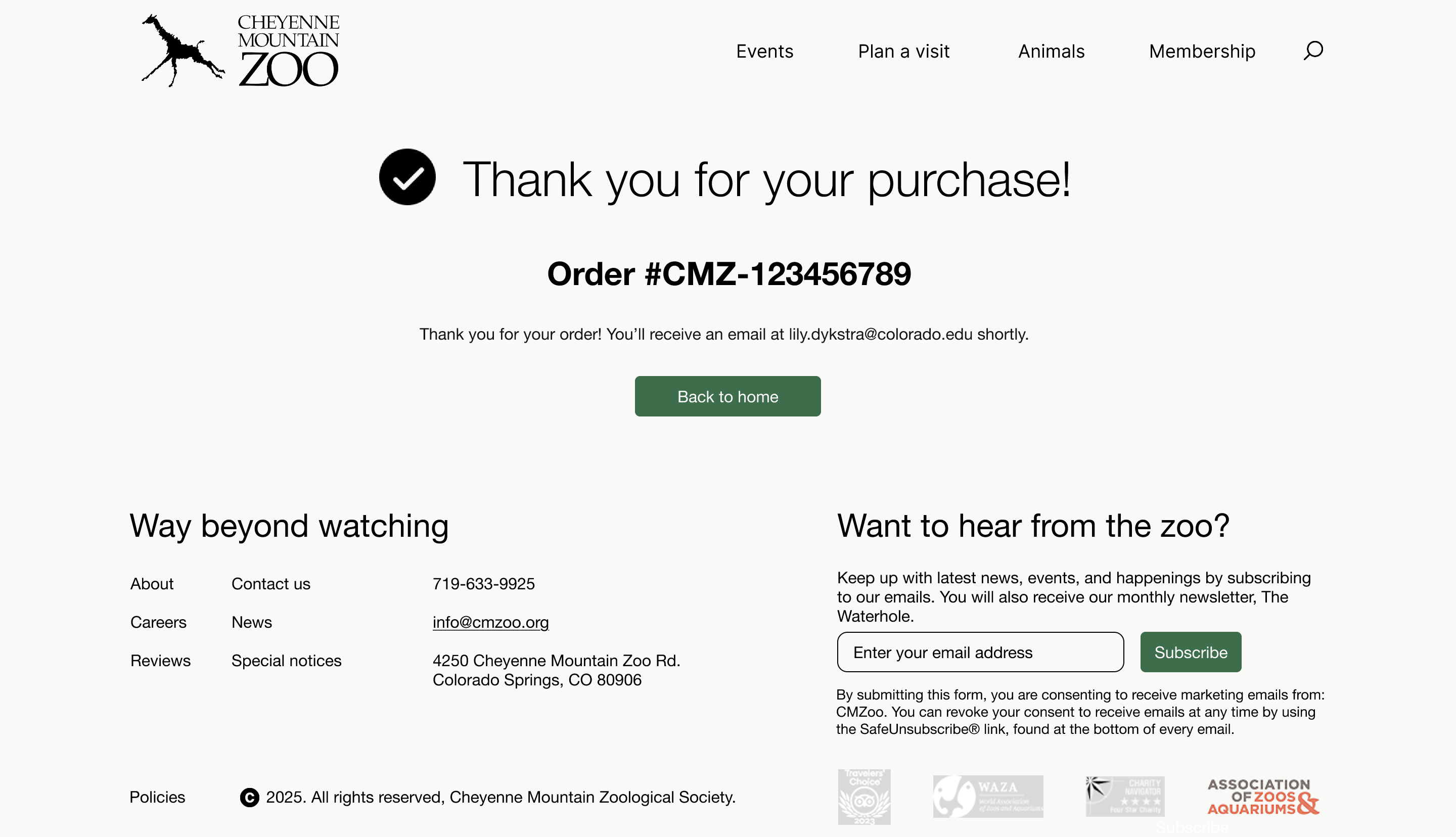
- Added an order number and complete summary to the confirmation page
Reflection
This project taught me how much intention goes into a "readable and welcoming" website. I had no idea how many micro-decisions compound into a user's overall experience. Iterating through four levels of fidelity, and responding to real user feedback at each, gave me a hands-on education in interaction design that I couldn't have gotten any other way.
This project deepened my understanding of digital craft — how typography, spacing, color contrast, and interaction state stack up into something that either earns trust or loses it. Watching real users navigate the prototype made clear how much weight every decision carries: a misplaced button, an unclear label, or a broken hierarchy can derail a flow entirely. Designing for that taught me to think in terms of user paths first, visual polish second.
If I revisited this project, I'd push the color system further (I played it safe with green and cream), explore more layout variations through A/B testing, and spend more time on the animals and schedule pages.